Interface experience with Wayback Machine
Name
Institution
Interface experience with Wayback Machine
Interface experience代写 The Wayback Machine is an internet archive that stores websites, images, text audio, and other resources found in websites.
Brief description of the website
The Wayback Machine is an internet archive that stores websites, images, text audio, and other resources found in websites. It is a U.S based non-profit organization that permanently store websites that are publicly available through web crawlers. It is a form of website library that preserve human knowledge and artifacts and make the library available to the public. It takes the semblance of the ancient Egypt library of Alexandria. There are more than 450 billion snapshots of websites that have been archived since 1996. The library has more information than any library in the world and more than 20 terabytes of digital contents are stored every month.
Through the use of WM, users can retrieve the old version of any website that allows web crawlers. Interface experience代写
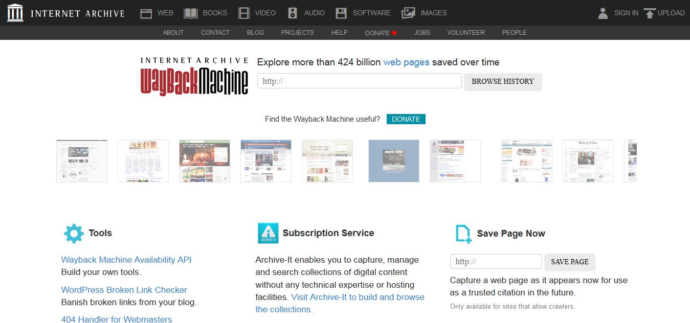
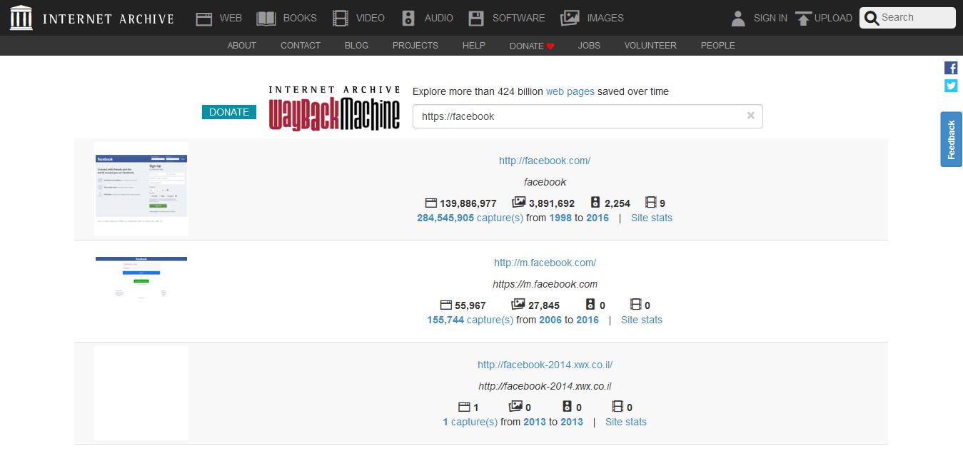
They also access subsequent updates of the website content ordered in dates. There is a search box on the WM homepage to type the website URL that one want to search from the archive. The search results give the date of website creation, number, and dates of successive updates and their links. The WM also provides information on the updates made on the site. Figure 1 below shows the homepage for WM. Figure 2, on the other hand, is the result after searching the Facebook web page.

Figure 1: Wayback Machine homepage

Figure 2: Search results for Facebook website
Since the Wayback machine is meant to serve global users, the main concern should be its user interface. The website has undergone massive redesigns every few years in an antiquated approach for developing the presence of other websites. The various changes try to assimilate the dynamics in user needs and demands of technology. Despite the many developments the site undergoes, users will always experience the interface differently and each user can propose a change to it to fit personal interaction.
What I like and do not like about the website Interface experience代写
There are things I like about the WM site. First, the site is simple on the landing page. It does not have many sections and menus is strategic at the top of the page and hence easier to navigate. Just below the search box are moving images with snapshots of various websites in the database. For a student like mean willing to learn about how it works, I only have to click on ant of the moving images and view to the site history.
However, I found the development of the website superficial and has not utilized modern web design technologies. It lacks a modern look with white color all over except at the black header bar. The color combination, design and structure make the web unattractive. The “upload” button at the header is not straightforward on what the user is supposed to upload. Also, there is a lot of white space in the content section and a small header bar. A small header bar makes the menus button to congested. Overall, the interface design makes the website look old and unattractive.
My experience with the site Interface experience代写
The human-computer interaction is a multidisciplinary approach to design regarding the interaction between humans and the computer. The HCI determines the user experience when using a website or a device. Concerning the WM, there was no gulf of execution since the intention of the developer corresponds to that of the user. The search button is conspicuous and only requires typing it the website URL or copy and pasting it then hit enter to search. The gulf of evaluation, on the other hand, is small because the menus buttons and links are easily discoverable and interpretable to my expectation and intention. The website is simple and hence presented in a format that I was able to derive the sequence of actions that I intended.

Additionally, the design of the website is easier for the user to create a mental model of the system process and its functionalities. This is achieved by the use of texts that are learnable and their meaning corresponds to their purpose. One example is “Explore more than 424 billion web pages saved over time” at the top of the search button is a self-explanatory statement that explains the whole purpose of the websites and creates expectation imagery in the user’s mind. Similarly, the mental model is facilitated by a small semantic distance where the developers used expressions that are suitable to the intention of the user and website purpose. These human factors positively impacted my experience on the WM website.
Improvement Interface experience代写
However, there are some improvements that the developers can make the website more attractive. The color blend is not attractive. Each section should have a different color scheme that matches the overall color gradient. The header menus should a bit larger to avoid the congestion of the buttons. Otherwise, the site simple to use and offers a good user experience.
更多其他:cs代写 商科论文代写 cs论文代写 Essay代写 人文社科代写 Review代写 艾莎代写 Case study代写 研究论文代写 艺术论文代写 文学论文代写 心理学论文代写 哲学论文代写 学术代写 Report代写 代写论文


